
A café recorded the total ice cream sales and the average maximum temperature of the day. The scatterplot shows the recorded data. The regression equation y = 13x − 598 estimates the total ice cream sales, y, of a day and the average maximum temperature, x, on that day.
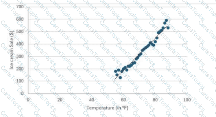
What does the slope represent in this context?
The dot plot illustrates the frequency of outdoor games played by students per week.
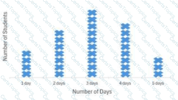
Which statement is true?
Independent events: P(A|B) = ?
Best chart for categorical data?
Copyright © 2021-2026 CertsTopics. All Rights Reserved
